
Reducing Image Load Online
Editorial correction — 7 September 2026
The author’s image files, scores, sizes, and timings below are preserved as historical observations; no encodes were rerun for this correction. Delivery advice and format claims have been corrected in place. This one-photograph comparison cannot rank formats for all images or encoder versions.
A big part of understanding any multimedia codec technology is knowing the application for such technology. For images, a big use case is web delivery. Compared to other multimedia, images are incredibly popular on the Web & knowing how to serve them properly can be a massive boon to your website’s traffic as well as less of a headache for users on slower connections or who are under bandwidth constraints. The most disappointing part is that images are often poorly done on the web; all too frequently will you run into a site serving massive photographic PNGs for no reason, or photography sites serving photographs fresh out of the editing software with no thought put into their final delivery. A little effort, patience, & knowledge will go a long way toward improving the user experience for individuals using your site, & this article will illustrate some of the basics.
These instructions are for photographic images; other kinds of images, like non-photographic, artwork, pixel art, etc. should likely be handled differently.
Viewing the historical samples
Some samples require JPEG XL or AVIF decoding and correct ICC color management. Support depends on the browser build and configuration; the original browser list was not a continuing compatibility guarantee. Use the JPEG examples when a format does not display, and test current image-format guidance on your actual targets.
Fire & Forget
First, we’ll illustrate what not to do, which is fortunately not incredibly difficult to avoid. Taking an image straight out of your editing software at a massive size will often bloat the size & resolution to something that isn’t generally usable for a website regardless of the codec you’re using & its quality per bit. It can be argued there are specific use cases that demand incredible resolution & fidelity coexist on the Web, but we won’t be covering those here. Here’s an example of a bloated image:
exported straight from Darktable at JPEG q90, with no scaling
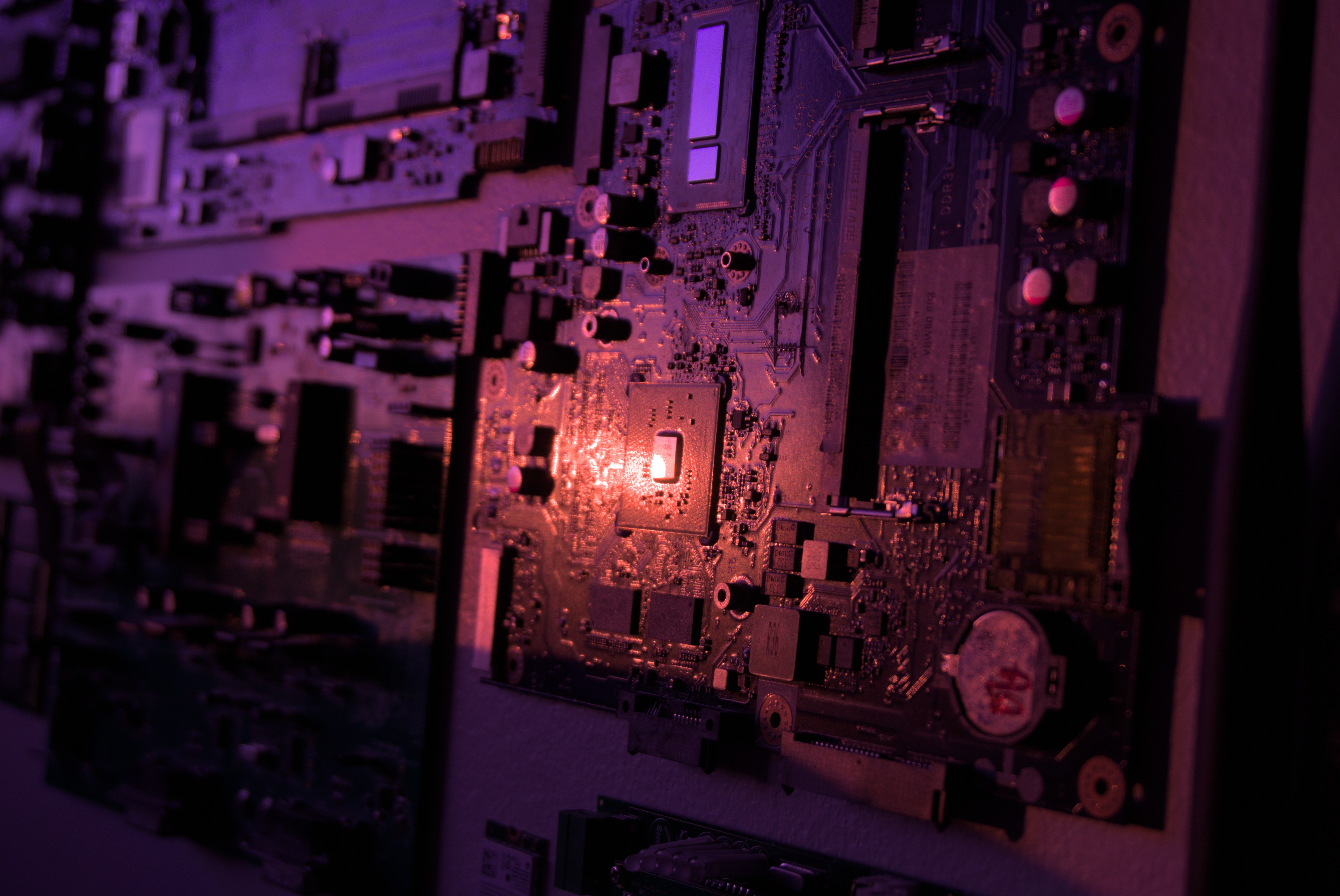
2.2 MB
Massive Improvement
Reducing unnecessary image dimensions can substantially cut transfer size. Choose source dimensions using both the displayed CSS size and device pixel ratio, and provide responsive candidates for different layouts. A 2× display can need about twice the CSS width in source pixels. Resizing may hide some artifacts but does not recover information lost in a previous JPEG export; resize from the best source available. HTML responsive images.
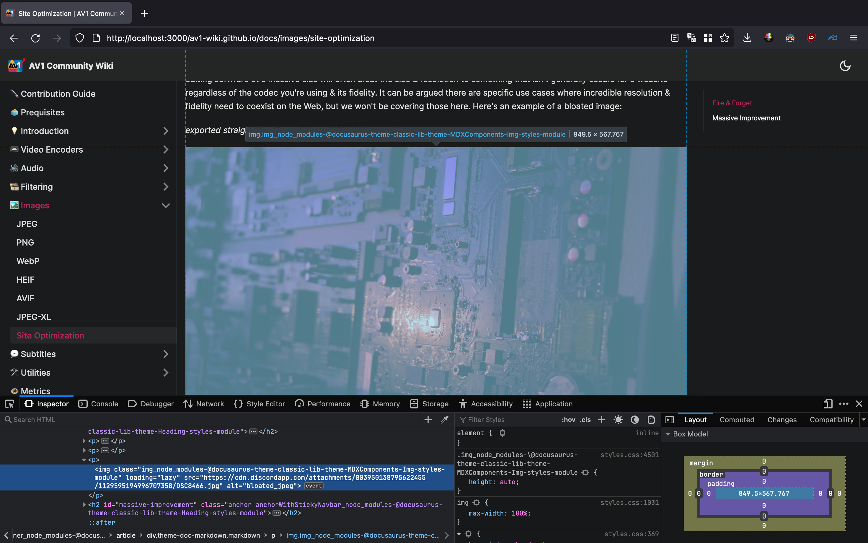 Inspect Element in Firefox. The Mac used to take this screenshot has a relatively high display resolution of 2560x1664. Because Macs scale things differently, we’re probably going to want to double the horizontal resolution here.
The width is the most important value here, so our new image is going to be exported with a width of 1699 pixels. This new image, encoded at JPEG q90 with cjpegli, looks like this:
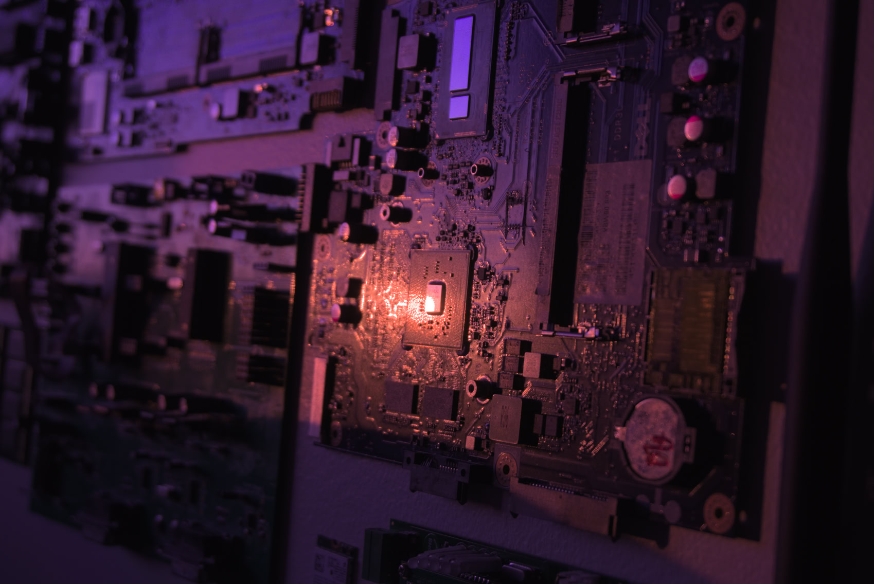
Obviously, there’s lost fidelity compared to the original, but considering this is so much smaller, it is worth the trade-off for many. It is also worth noting we are using an improved jpeg encoder in the form of cjpegli, although that is secondary to the resize. If it doesn’t look as good as you want it to, you can always scale the resolution up a bit, though currently, it looks plenty passable for its size.
2.2 MB -> 233 kB
| Category | Value (kB) |
|---|---|
| Original | 2200 |
| Optimized | 233 |
Values are taken from this article; 2.2 MB is shown as approximately 2,200 kB for comparison.
Lazy Loading
Add loading="lazy" to the img element, including when it is inside picture, for images below the initial viewport. It defers fetching until the browser’s loading threshold is approached, and can save bandwidth if the visitor never approaches the image. It does not reduce the size of an image that is eventually fetched. Avoid lazy loading a prominent image needed for the initial view. HTML lazy-loading behavior.
<picture> <img src="/images/jpeg_fallback.jpg" alt="alt text" width="1699" height="1136" loading="lazy" /></picture>New Codecs
This historical experiment compares JPEG, AVIF, and JPEG XL encodes of one photograph. It does not test WebP or HEIC, so it cannot establish that WebP loses to JPEG, that HEIC has been superseded in every application, or that JPEG XL and AVIF always compress better. Encoding time, fidelity target, alpha, bit depth, color management, and decoder support all matter. Compare representative images with current implementations; see AVIF, JPEG XL, and WebP. WebP supports both lossy and lossless coding, with different capabilities. WebP specification.
Fallbacks
Provide an image the target browser can decode. A picture element can offer several formats with a JPEG fallback; the browser selects a supported source according to source order and its selection rules. Support is not a prediction about a format’s future adoption. HTML image selection. For example:
<picture> <source srcset="/img/jxl_image.jxl" type="image/jxl" /> <source srcset="/img/avif_image.avif" type="image/avif" /> <source srcset="/img/webp_fback.webp" type="image/webp" /> <img src="/images/jpeg_fallback.jpg" alt="alt text" width="1699" height="1136" loading="lazy" /></picture>Here the browser can select JPEG XL, AVIF, WebP, or the JPEG fallback in that order. Each extra variant adds encoding and storage work; include formats whose measured savings and target support justify maintaining them.
Compression Efficacy
The following preserved commands document the author’s historical encodes, not current CLI recipes; current options are covered in the linked format guides. Let’s look at how those image examples compare to the original. We’ll be aiming for high visual fidelity, so around the same quality as our initial JPEG encoded with cjpegli (which scores ~83.01 with the SSIMULACRA2 visual fidelity metric).

137.0 kB JPEG-XL image, encoded with cjxl lossless.png out.jxl -d 1.49 -e 9. Score: ~83.04 3.06s user time
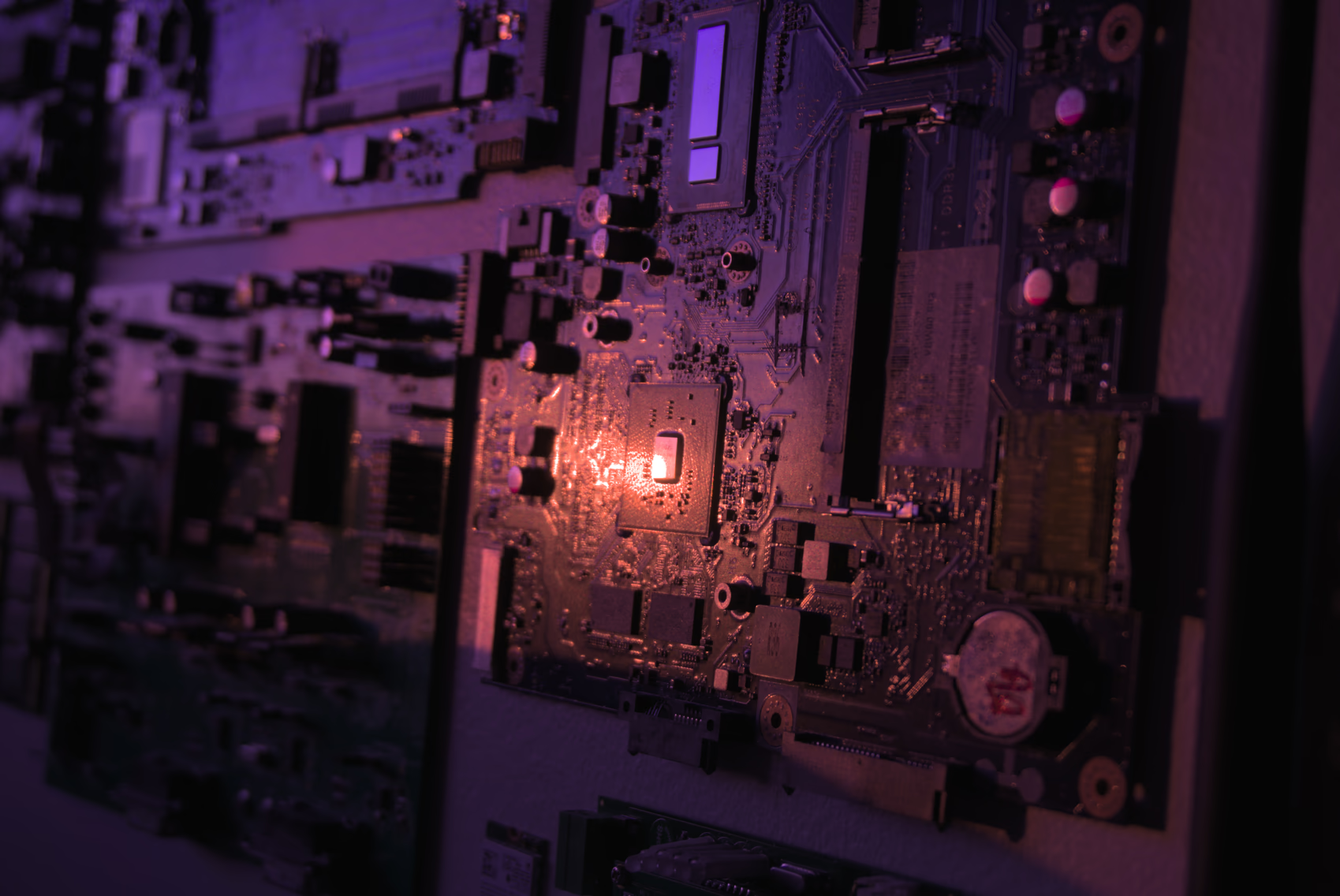
124.8 kB AVIF image, encoded with avifenc -c aom -s 4 -j 8 -d 10 -y 444 --min 1 --max 63 -a end-usage=q -a cq-level=16 -a tune=ssim lossless.png out.avif. Score: ~83.03 7.54s user time
JPEG XL can preserve an existing JPEG’s coding information so that the original JPEG file can be reconstructed byte-for-byte when reconstruction data is retained. This is distinct from encoding decoded pixels losslessly. The score mismatch reported below is unresolved: it could involve differing decode or color-conversion paths and is not evidence of improved fidelity. Verify reconstruction by decoding back to JPEG and comparing file hashes; do not infer correctness from close metric scores. cjxl documentation.

189.4 kB JPEG-XL image from JPEG, encoded with cjxl input.jpg input-recomp.jxl -d 0.0 -e 9 --brotli_effort=11. Score: ~84.92 (???) 0.67s user time
The author’s XYB JPEG example uses jpegli’s --xyb mode and its associated ICC profile. Displaying the intended colors requires correct profile handling; decoders that ignore the profile can show incorrect colors. This is not universal display compatibility, and the size/quality result below applies to this sample. jpegli documentation.
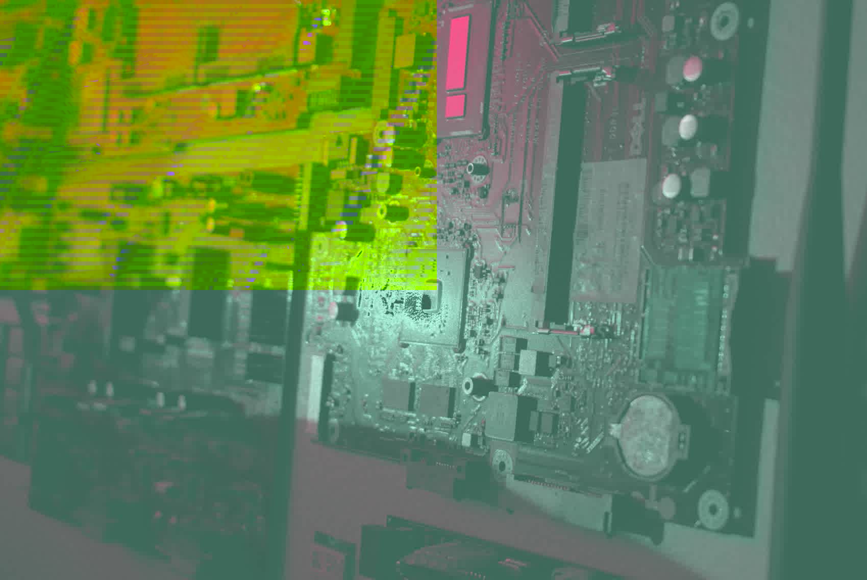
208.3 kB XYB JPEG, encoded with cjpegli lossless.png out.jpg --xyb -d 1.155. Score: ~83.04 0.10s user time
At the author’s approximately matched SSIMULACRA2 scores, this AVIF file was smaller than the tested JPEG XL and JPEG files. That supports a result for this image and these settings, not a general ranking or identical perceived quality. The input was 16-bit PNG, but a lossy output accepting that precision does not preserve all original sample information. The reported encoding times are observations from this run.
Responsive Images
Displaying an image that is too large for a viewport is a waste of bandwidth, & displaying an image that’s too small for the viewport leaves fidelity to be desired. Luckily, we have the Responsive Image Linter that can help us figure out which image sizes we should be using.
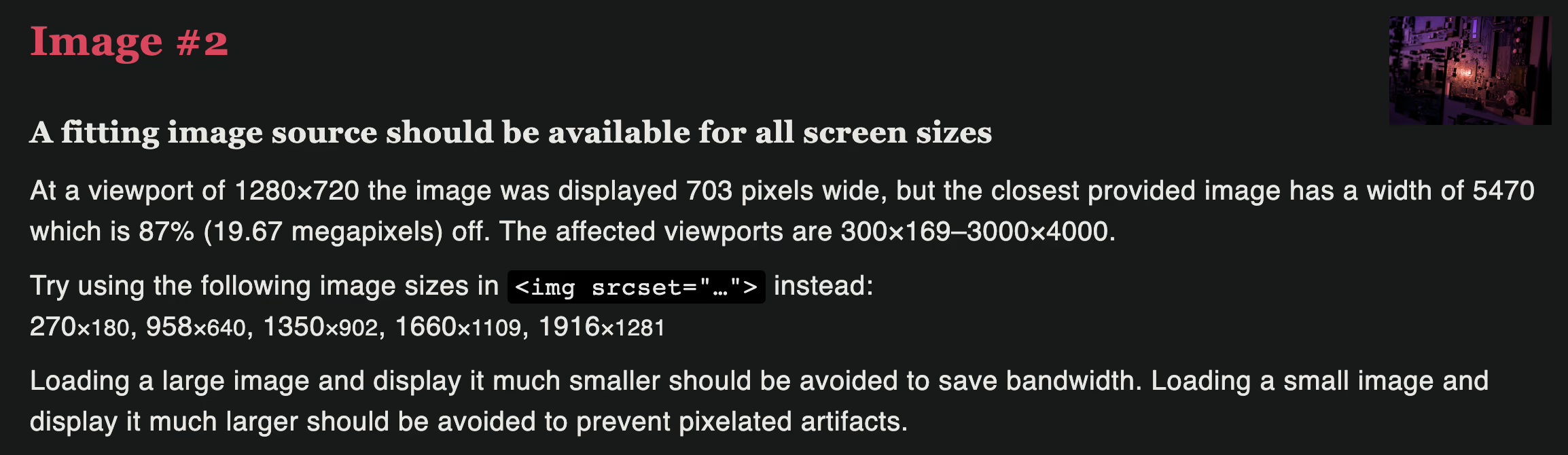
In our fire & forget example, we see that we are serving an image that is far too large. We already know that, but now we can see that given various viewport sizes we could be serving images that have respective widths of 270px, 958px, 1350px, 1660px, & 1916px to optimize for delivery to a variety of different devices. Here’s how we’d write that in HTML:
<picture> <source type="image/jxl" srcset="/img_270.jxl 270w, /img_958.jxl 958w, /img_1350.jxl 1350w, /img_1660.jxl 1660w, /img_1916.jxl 1916w" sizes="(min-width: 2000px) 1916px, (min-width: 1700px) 1660px, (min-width: 1400px) 1350px, (min-width: 1000px) 958px, calc(100vw - 24px)" /> <source type="image/avif" srcset="/img_270.avif 270w, /img_958.avif 958w, /img_1350.avif 1350w, /img_1660.avif 1660w, /img_1916.avif 1916w" sizes="(min-width: 2000px) 1916px, (min-width: 1700px) 1660px, (min-width: 1400px) 1350px, (min-width: 1000px) 958px, calc(100vw - 24px)" /> <img width="1699" height="1136" alt="alt text" srcset="/img_270.jpg 270w, /img_958.jpg 958w, /img_1350.jpg 1350w, /img_1660.jpg 1660w, /img_1916.jpg 1916w" sizes="(min-width: 2000px) 1916px, (min-width: 1700px) 1660px, (min-width: 1400px) 1350px, (min-width: 1000px) 958px, calc(100vw - 24px)" src="/fallback.jpg" /></picture>It is worth noting that this example above & the example below aren’t perfect implementations of a responsive image given the conditions of this site, but the general concept still applies. Some things to note:
srcset= the images available to your browser to serve, & their respective widthssizes= the conditions given to the browser explaining under what conditions should it serve which image(min-width: XXXpx) YYYpxdescribes an image slot of YYY CSS pixels when that viewport condition matches. The browser uses the slot size, device pixel ratio, and its selection policy to choose a candidate; it is not an instruction to fetch an exact pixel width.calc(100vw - 24px)= Usually preceded by a (min-width) condition. Specifies a value the browser should calculate on its own to pick the closest option from the srcset. Let’s say we have(min-width: 997px) calc(75vw - 257px). This means given the viewport is at least 997px wide, calculate 0.75 * the current viewport resolution - 257 to find the closest image in the srcset to fit the number of pixel specified.

That’s all! Massive thanks to Auto-Rez Media Technologies for the inspiration behind this article & explicit permission to use their Reduce Your Page’s Image Load blog post when writing this entry. I have confirmed with their leadership that this wiki entry can be safely licensed under CC BY-SA 4.0.